I hate Rococo design. I doubt that’s a controversial opinion, I don’t see many modern homes with cherubs or flower designs on pastel walls. Rococo furniture is a far cry from the Midcentury Modern pieces that have been prized for the last 5 years.

When I was a college student, I had the good fortune to study abroad in France and visit Versailles. Parts of the palace are gorgeous, and its easy to see how impressive the furniture, construction, and vastness of the property are under the museum lights. During my first tour, I was unimpressed by the Hall of Mirrors. I expected to be awed by the light and opulence. It really didn’t stand out from the rest of the Baroque architecture throughout the palace.
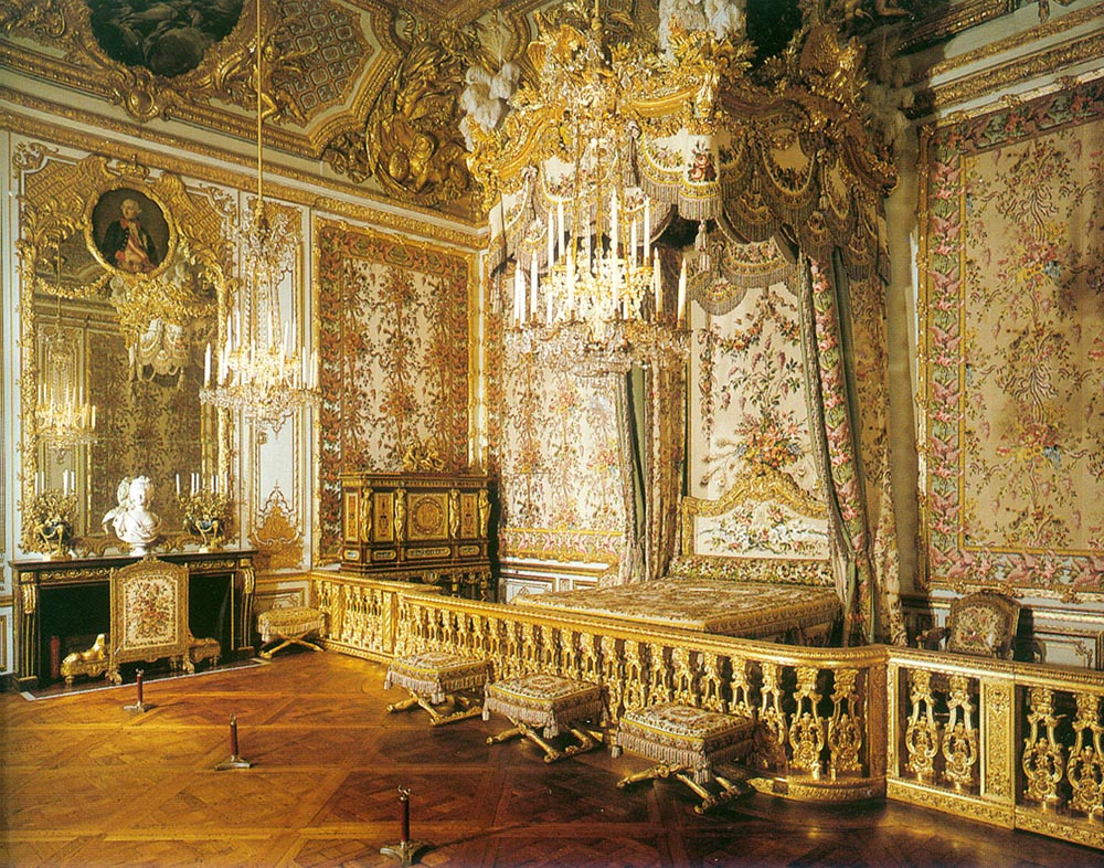
The Queen’s Bedchamber, on the other hand, was impossible to miss. It was easily as bright as the hall of mirrors, but instead of having stone columns to contrast the gold, the Queen’s Bedchamber used flower motifs, pink and more gold.
If you have a home VR set up, you can see the the rooms described above for free at the official Versailles website.
Even after my initial experience of Versailles (and other Rococo experiences), I remain justified in my experience with Versailles. But my experience with the grounds differed in myriad ways from the experience of those in the 18th century. One key difference was how the space was lit.
With museum lighting in every room, it isn’t shocking that I wasn’t impressed by the brightness and glimmer of the Hall of Mirrors. The sun coming through the windows and bouncing off the mirrors and gold is no brighter than museum lighting at 3700K (more on this later) that flooded every room. If I toured a building lit only by small translucent windows and whale fat or beeswax, I would have found the Hall of Mirrors to be an incredible open space.
Rococo décor brought whimsy and light to otherwise dark rooms. Baroque design, while similar, lev . Rococo is an attempt to heighten both the brightness of the room and create smaller, more intimate spaces.
Maybe we need a form of Rococo revival today.
Earlier this year, I made predictions about the state of interior design in 2030. One of those predictions involved a shift away from the open-concept floorplan with Bobby Blue and Grey. Smaller rooms will provide an opportunity to deliberately use light as a key design element in a way that isn’t possible in open spaces. The vast majority of lights sold and stocked by Home Depot are soft white (2700K). When a vast space requires overhead lighting, the lighting needs to be neutral and consistent. Lamps are able to add contrast or accent a space, but the lighting is defined by the room in its entirety.
Light temperature is measured in Kalvin. By comparison to soft white, the candles in Versailles burned around 1800K. The lower the Kalvin value, the warmer the light.

In the modern Rococo revolution, I envision smaller comfortable spaces with varied light used to create different atmospheres. Dining rooms lit low with warm light (~2000k). Kitchens and bathrooms with daylight bulbs that prioritize accuracy (~5000k). Entryways and foyers lit in between to smooth transitions between spaces. I don’t envision cherubs, or flowers as normal wall coverings. I still hate Rococo.
Light alters our perception of space, mentality, and design options. Hopefully my prediction for the next 10 years proves true. Maybe I won’t hate the next Rococo revival.


